
When a Child Gets Stuck, Is It Always the Learning?
Blogpost
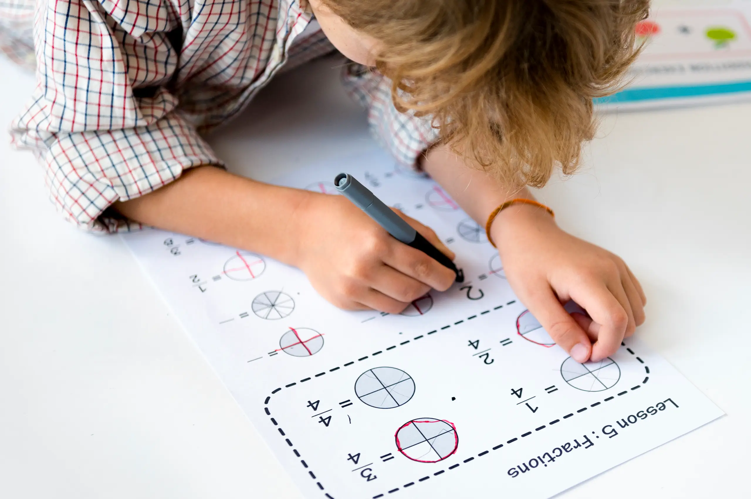
“What am I supposed to do here?”
That question can mean several things.
A child might be struggling with the concept, an unfamiliar word, or the instruction. They might also be struggling to find how the pieces on the page fit together.
Before explaining the lesson again, it’s worth looking at the material.
Where should the child begin? Which example belongs to this task? Where can they show their working?
My recent article about Sweden’s renewed emphasis on books explored when digital tools help children learn. That discussion raises another question: whether we choose a book or a screen, how clearly are we presenting the task?
In my work designing K–12 materials, these are decisions we make before a page reaches a classroom.
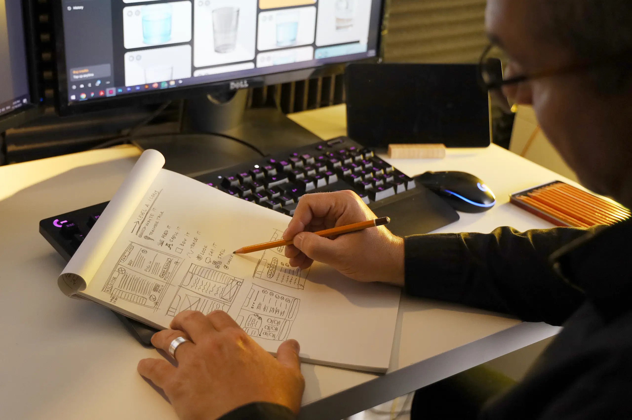
A page can contain a good explanation and useful activities, yet still leave a child unsure where to start.
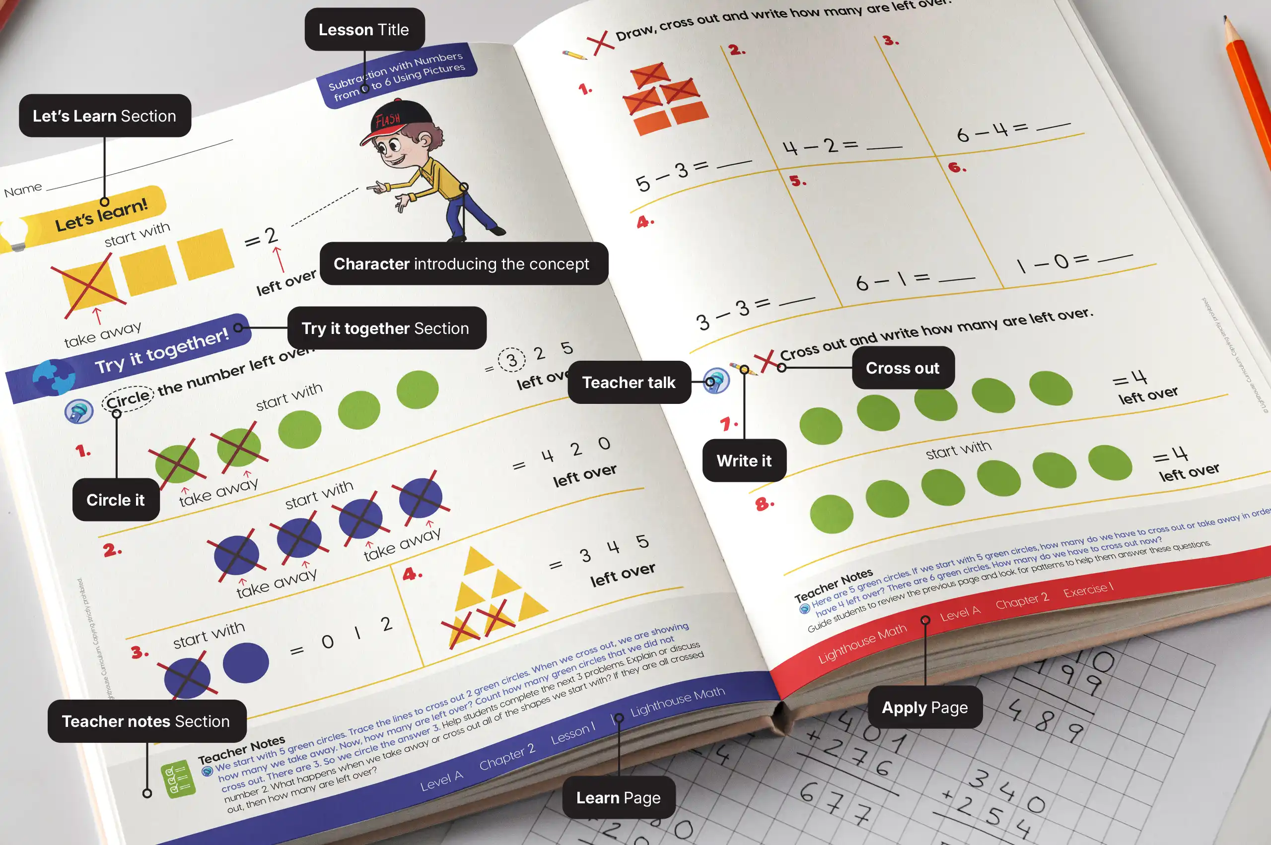
In a math series we worked on, we made the lesson stages visually distinct:
The purpose was to make the route through the lesson recognizable as children moved from one topic to another.
Research supports the broader principle. A 2020 meta-analysis combined 29 experimental studies involving 2,726 participants. It found that cues highlighting important information improved learning outcomes on average, although the effects varied.
This is called signaling: helping learners notice important information and its organization. It gives us a reason to use headings and highlighting purposefully; it does not prove that our particular layout improves learning.
A quick check: ask a child to point to where they would begin. If they hesitate, explore why before assuming they don’t understand the subject.
Imagine trying to understand a diagram while repeatedly searching elsewhere for the explanation.
That search adds work.
Richard Mayer describes the spatial contiguity principle: learners tend to learn better when corresponding words and pictures appear close together rather than far apart on a page or screen.
For a designer, this becomes a practical question: is the explanation close to the illustration it describes?
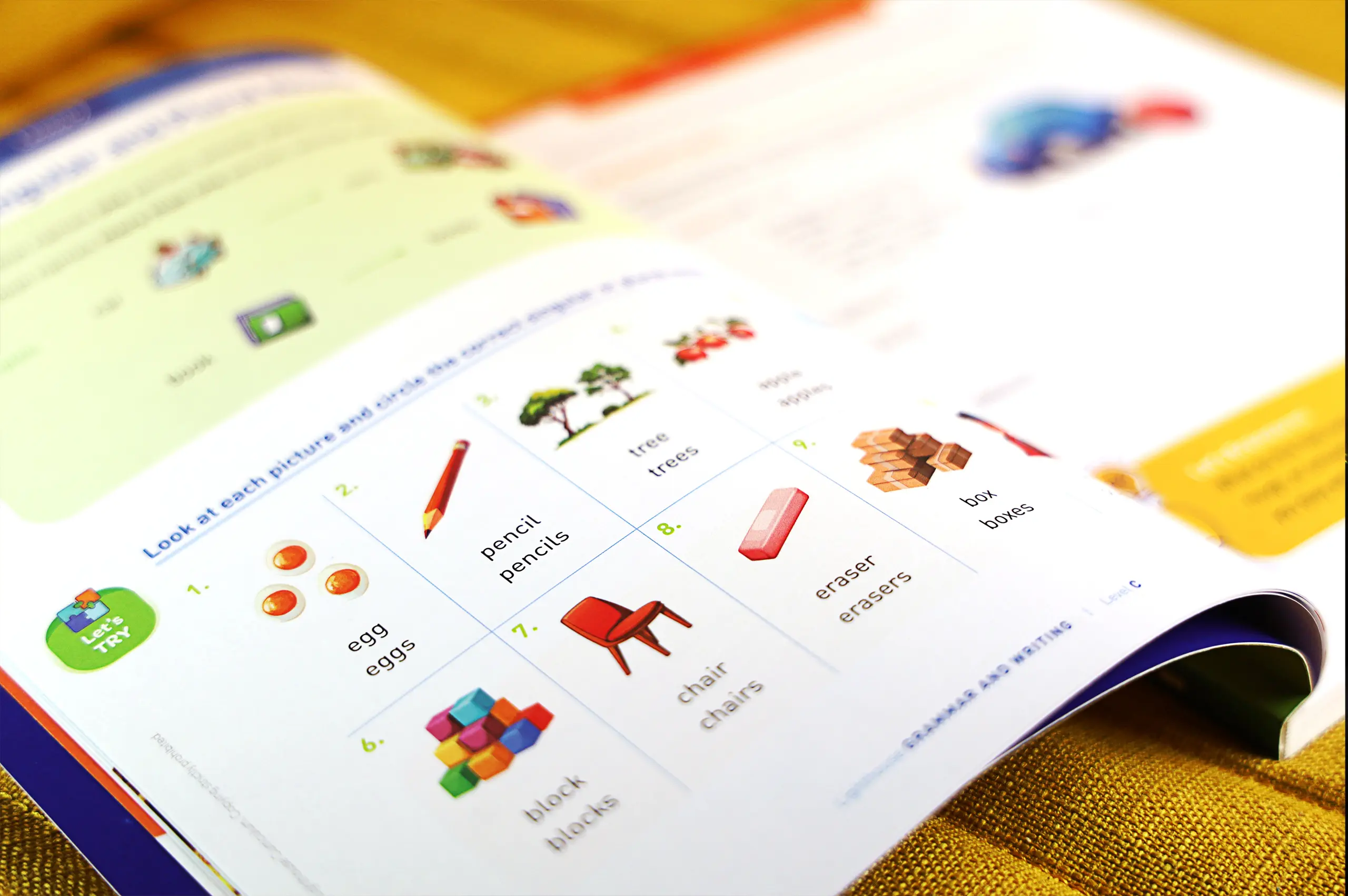
A quick check: point to everything needed for one activity. Are the relationships clear, or do you need to explain where to look?
A correct answer tells us something. The working that led to it can tell us more.
Children may need space to draw, test an approach, cross something out or try again. A page that accommodates only the final answer can make that work awkward.
During layout review, completing an activity at its intended printed size is a useful check. Include the steps and a correction—not just the answer.
A quick check: does the available space fit the kind of thinking the task asks for?
Making a page easier to follow doesn’t require making the subject easier. The aim is to give children a clearer way into the work.
Some of the decisions behind the finished pages.
I can explain the design decisions. Understanding their classroom impact also requires teachers’ observations and students’ work.
For parents and teachers, a child’s hesitation can be a useful clue. For publishers and designers, it can point to something worth reviewing.
The next time a child asks, “What do I do here?”, what do you check first—their understanding, the instruction, or the page?


